ShopDreamUp AI ArtDreamUp
Deviation Actions


Comments122
Join the community to add your comment. Already a deviant? Log In
'Critique requested', huh? That's a pretty tall order, but I'll try. <img src="e.deviantart.net/emoticons/s/s…" width="15" height="15" alt="
Well, one thing I do a lot when I'm critiquing written work I'll insert annotations of how I feel at different parts so the author can ensure that that's both what they wanted to feel and that the intended message came across the to the reader. I guess I'll try and apply the same thing here. Maybe that'll be of value if nothing else is.
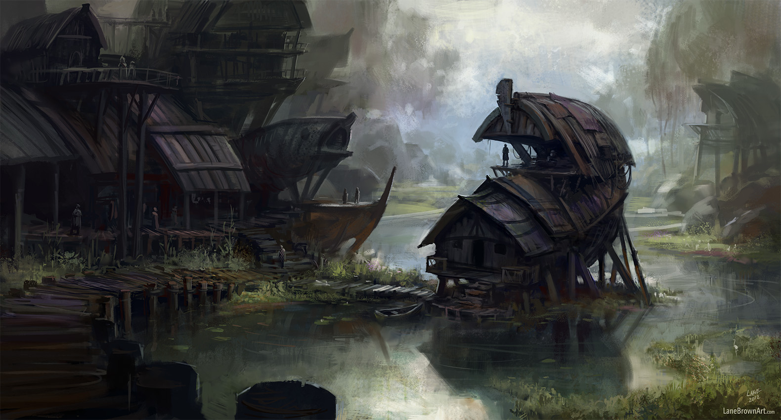
Here I imagine a village of fishermen, who live out their very humble lives in peace and contentment, the somewhat gloomy mood... Although it also feels tranquil. It has an aura of unique culture and traditions established by those who are isolated as they are in their protected haven. Honestly, I look at each of the figures in this piece and can easily imagine the, moving about, and can get a glimpse into their lives. When an artwork does that, I believe it has always accomplished it's goal no matter how detailed or talented the work was, although this matter how detailed or talented the work was, although this had a good share of both.
I'm afraid what I usually call people on is composition, but you managed to snatch that away from me. Objects, people and lighting all point my attention to the figure standing on The platform in the middle-right of the screen before my eye wanders around the painting only to be drawn inexorably to that point yet again. Colors are interesting and harmonious... Okay, this is my best point on critiquing; the boat-structure in the middle left with the two people standing on it. While the oranges that are strongly present on it's underside are also present in other parts of the painting, they are both duller and ore discreet. The strong and almost bright hues of orange on that ship-structure actually become somewhat distracting in their contrast to the rest of the painting. The change in color is good for the interesting variety, but maybe dulling it down a bit would make it less distracting.
Anyway, in summary, a beautiful work of art that I feel guilty of being unable to find fault in, offering only that weak point of criticism. I apologize I could offer more constructive criticitsm. Thank you for creating this for us. I'm always excited to see a work of yours in my deviations box.